Café Sa’SIS

1 patisserie. 2 sisters. 2nd generation.
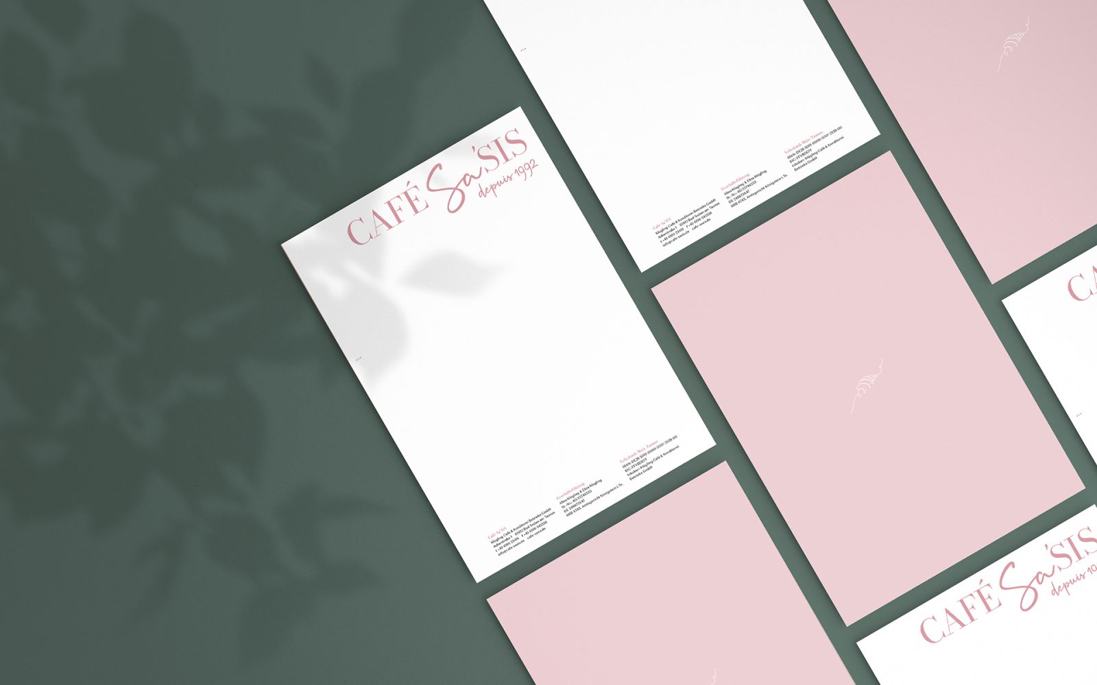
We were able to accompany Alina & Eliza Klügling on a big step ... Café Merci became Café Sa'SIS. Our task was to develop a new name and corporate design including a logo, color scheme and stationery as well as a menu and unique outdoor signage.
Café Sa’SIS
01 Logo & Naming
Café Sa’SIS
Sa’SIS means „her sister“.
The combination of the French “sa” (eng. her) and the English “sis” (abbreviation sister) represents the sisters’ affinity and connection to both languages, French and English.
And of course the name conveys both the sisterhood and the family atmosphere that can be felt at the café.
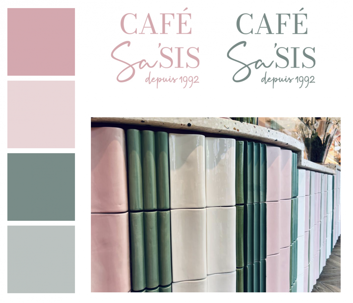
02 Colorcode
Café Sa’SIS
In order to create a harmonious overall look, we chose the colors based on the interior.
The colorcode focusses on two muted but fresh shades of pink and an elegant sage in two shades.
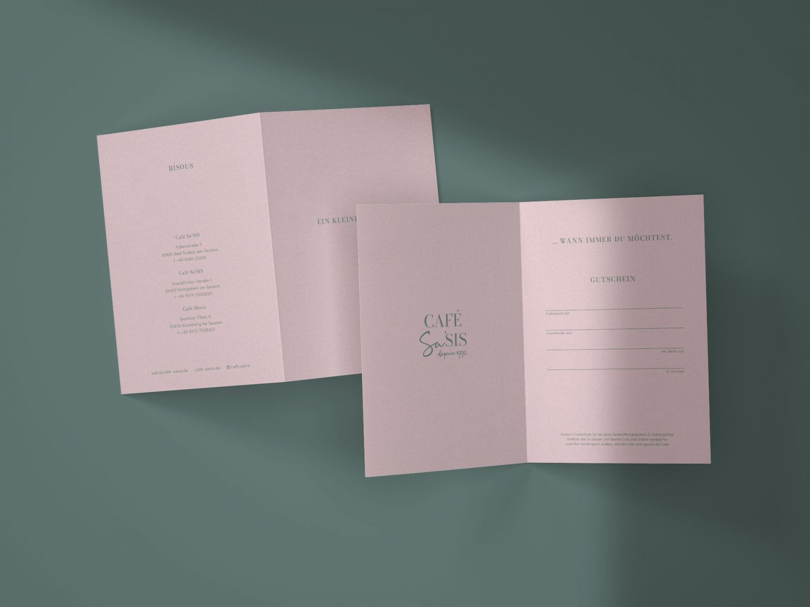
03 Branding & Corporate Design
Café Sa’SIS

